Scientific visualization is the process of converting data into a visual form that is easy to comprehend. It gives colors to numbers, lines to sequences and bars to arrays. Visualization is as much art as science. Edward Tufte's "The Visual Display of Quantitative Information" is the go-to book for an elaborate discussion on this topic. In this series, we will abstain from discussions on the philosophy of visualization and focus on providing a set of tools, rules of thumbs and codes that can come in handy while creating diagrams for your report/thesis/article.
In this first part, we will describe briefly what makes a good figure/plot, the packages out there for scientific visualization and end with two practical examples. In the first one we convert a shabby looking figure into a half-decent one that can be pepped up to publishing quality later. And in the second we look at a complex enough one that you would likely require for your work.
We will resort to the matplotlib library in python (primarily because its open-source and integrates well with most of what the scientific community does today) and use the format used in this amazing open-source book by
Nicolas Rougier.
Elements of visualization
When dealing with figures, a simple rule of thumb that one can use to ensure presentability is the rule of 3 Cs: consistency, clarity, and coherence (or harmony). Though we do not want to dwell on the philosophy behind these ideas, it is nevertheless a handy tool to make neat figures.
Consistency
Figures that use consistent size, line style, thickness, color, axis, aspect ratio are intrinsically better looking than ones that break these rules. A simple reasoning could be that one needs to spend a lot of time dealing with the inconsistencies which make the reader irritated. However, consistency is easier said than done. Producing consistent figures requires complete control over the package you use to plot/generate your figures.
Clarity
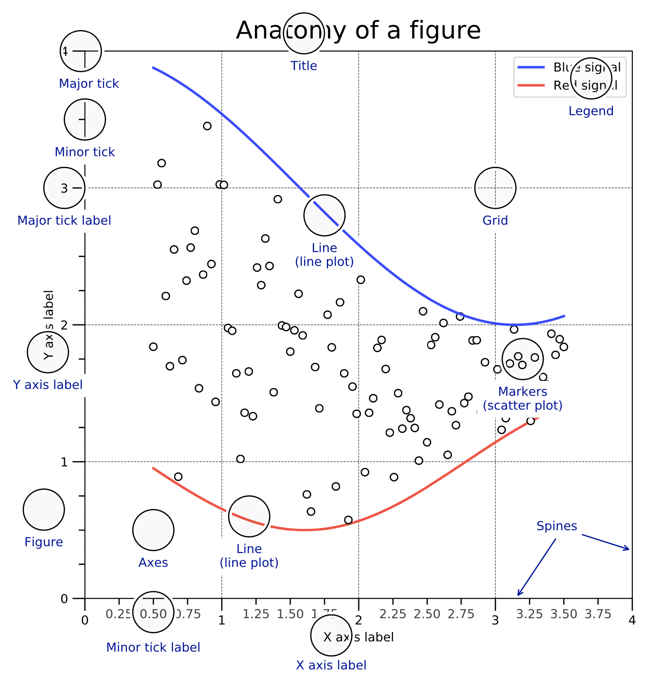
This is the easiest check of the 3 Cs. Clarity for the most part means spacing. Ensuring different parts of the figure have enough breathing space ensure clarity. Of course there is also the matter of size. Take for example in the figure below from Rougier's book. It is easy to see that clarity would be lost if the legends were too small to read or if the minor tick labels were larger than major tick label. One often has to ensure proportions are maintained for clarity to manifest itself.
Coherence
Coherence or harmony is a cliché in arts as in many ways modernism and post have tried to break away from traditional notions of it. It is nevertheless a useful idea in scientific visualization, unlike in art. Coherence helps ensure that the intended message of a figure is conveyed across explicitly than letting the reader decipher it. When we speak of coherence, we refer to the fact that several aspects of a figure have to come together (add harmoniously if that word means anything to you) for it to be presentable. This is particularly relevant when we have multiple sub-figures in a figure. Each of them might look clear and consistent on their own but when placed next to each other it can be jarring. Of course, what is dissonant to one can be musical to the other. So there is some amount of subjectivity here and is often left to the researcher's discretion as to which one is better. For example, in my view an all black & white sub-figure next to a bright contour plot makes it dissonant.
Ultimately, when you make a figure ensure that the 3 Cs are obeyed and as you can see you have to make artistic decisions on what goes well but with a directed goal of conveying the message across to the reader clearly (not necessarily loudly).
Practical examples
Producing production quality figures hinges on 2 things, the software package you use to plot and your skill level in utilizing the functionalities of the software. There are 2 packages I recommend for creating scientific figures (i) PGFPlots, (ii) matplotlib library in python. Unfortunately, Matlab doesn't fall under the category of production quality softwares as the utility is limited and the interface is cumbersome in my experience. There are of course fancy plotting packages such as plotly, seaborn and so on, however my familiarity with PGFPlots and matplotlib has proved sufficient for most of my scientific needs.
PGFPlots, a TikZ based package, is excellent if want to create plots from the templates/examples provided. The primary advantage is that it can be embedded inside LaTeX directly with typographical details (such size of text, selected typeface and so on) taken care automatically. But it gets tedious if one has to put together multiple sub-figures or if the plot is very detailed. Having said that, this is coming from my limited experience with the package.
matplotlib, on the other hand, has a huge community online that is active and any small or big issue that you would likely come across is mostly addressed. And coupled to that is this excellent book which provides all the codes for customization.
Okay, now lets see how we can put the ideas from the 3 Cs to use in a simple example.
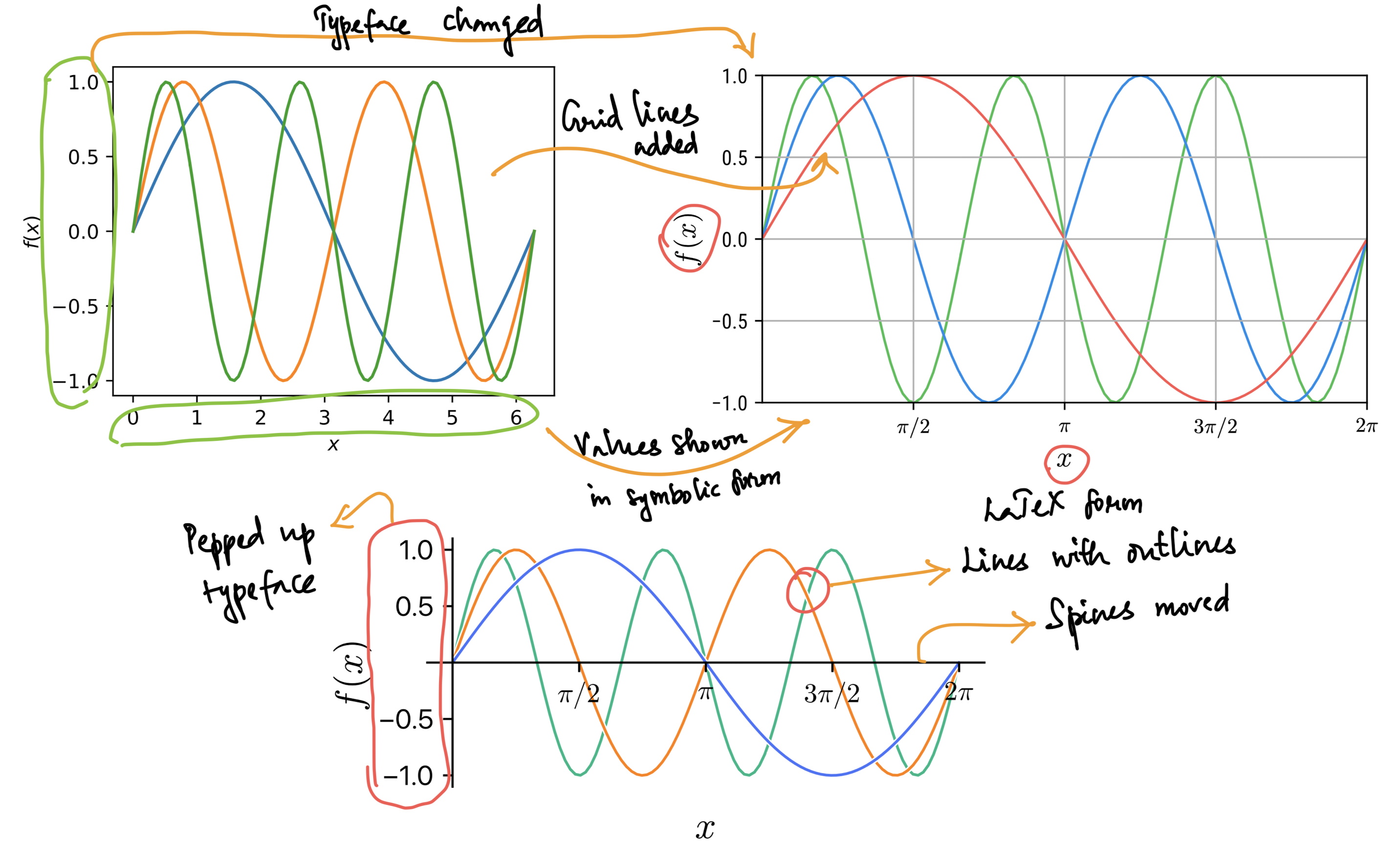
The above figure shows 3 versions of the same data with 3 different levels of the 3 Cs. Each version, as you can see quite evidently, has improved from a few minor changes (highlighted using pointers and handwritten text). The last version looks dramatically different from the first sub-figure. It is still not close to production quality and that depends on where this diagram will end up in the article. The python code used to generate these figures is available in this jupyter notebook. You will immediately see that the complexity of the code to generate the last one has gone up quite a bit as we fine-tuning every detail of the plot. But thats the cost one has to pay to create a good diagram.
The example above is simple and is definitely not something you would make for any article. Let us take a complex enough example that might be required for your report/thesis/article. We will divide the complexity into smaller bits and put them together.
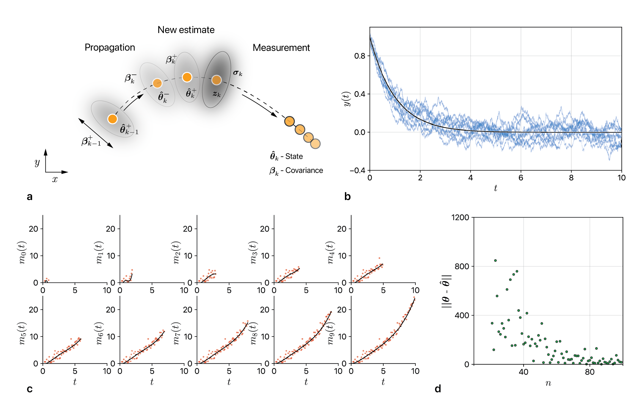
Sub-figure (a) above is a schematic which I made in Adobe Illustrator and can very well be made of the same quality in Inkscape, an opensource package. The 2nd part of this scientific visualization series will delve into characteristics of a schematic (again using 3 Cs). Let us for now assume that we are aware of the nitty-gritty of making a good schematic. First we see that there is consistency in the typeface used across all the sub-figures. Second we see that there is uniformity in the thickness of axes-lines/spines of the plots. Third the size of all the labels is consistent. Fourth I have spaced the variables, labels and the gap between plots in a manner that ensures clarity. Last the color scheme is not heavy on the eyes and goes well with whatever is being shown in the plots. I still feel that there are things to improve in this figure but its close to being ready for a report/thesis. A good place to find colors that go well together is Adobe Color where you can borrow palette from artists who understand how to use the color wheel. Beyond reading this post, if you really want to make good diagrams like those in this post, please go through the code in this notebook. I will end this part of the post by saying that making good diagrams that convey the science efficiently is not a facile/plebeian task but one whose efforts are sharply delineated.